The Company Overview section provides a comprehensive dashboard that displays your organization’s key performance metrics and trends. This section helps you track your business performance across different time periods and visualize important data through interactive graphs and summary statistics.Documentation Index
Fetch the complete documentation index at: https://docs.aiinsurance.io/llms.txt
Use this file to discover all available pages before exploring further.
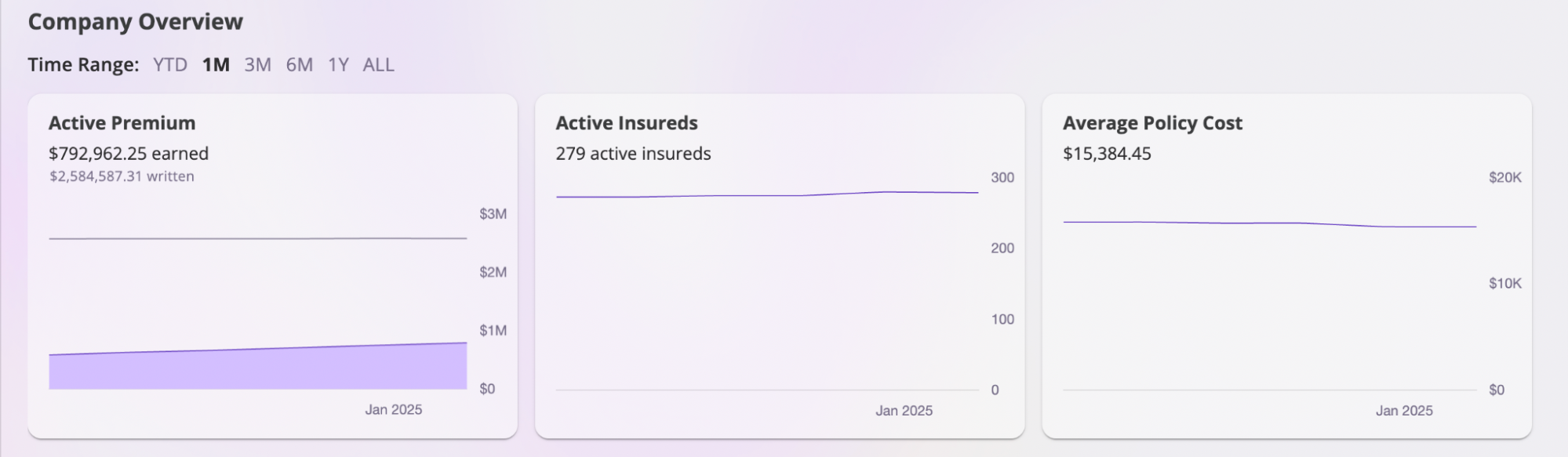
Time Range Selection
The Company Overview dashboard includes a time range selector that allows you to view your organization’s performance across different periods. When you click on different time ranges, the dashboard will automatically update to show:- Graph data for the selected time period
- Summary statistics relevant to that timeframe
- Trend analysis based on the chosen range
Dashboard Graphs
The Company Overview section includes 8 interactive graphs that visualize your organization’s performance:| Graph | Type | Purpose | Key Metrics |
|---|---|---|---|
| Written Premium | Area Chart | Track premium growth trends | Written vs Earned premium over time |
| Incurred Loss Ratio | Line Chart | Monitor claims performance | Loss ratio percentage (0-100%) |
| Net Loss Ratio | Line Chart | Assess risk management effectiveness | Net loss ratio after reinsurance |
| Loss Development | Multi-line Chart | Predict ultimate loss amounts | Loss development by cohorts over time |
| Active Primary Insureds | Line Chart | Track client growth patterns | Number of active insureds over time |
| Average Policy Cost | Line Chart | Monitor pricing trends | Average policy cost over time |
| Open Accounts | Bar Chart | Overview of quote pipeline | Quote distribution by status |
| New Business vs Renewal | Bar Chart | Compare business performance | New vs renewal quote breakdown |
Interactive Features
- Time Range Selection: All graphs update based on selected time period
- Hover Tooltips: Hover over data points for specific values
- Current Values: Real-time metrics displayed on each graph
- Responsive Design: Graphs adapt to different screen sizes
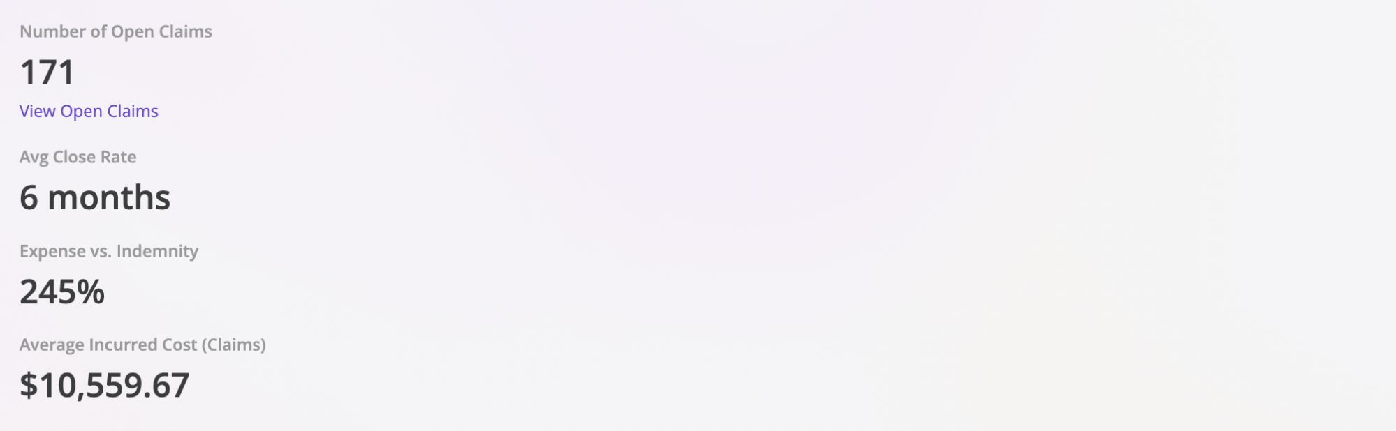
Key Metrics Summary
The Company Overview section also provides a snapshot of important business metrics that update based on your selected time range:- Open Claims: The number of active claims your organization is currently handling
- Claim Closure Rate: The average rate at which claims are being resolved
- Cost Difference: The percentage difference between insured’s incurred costs and your company’s payouts
- Average Claim Cost: The average cost of claims during the selected period
Interactive Map
The Company Overview dashboard includes an Interactive Map feature that provides a geographical visualization of your organization’s data. This feature displays all claims, policies, and insureds on an interactive map, giving you a spatial view of your business operations.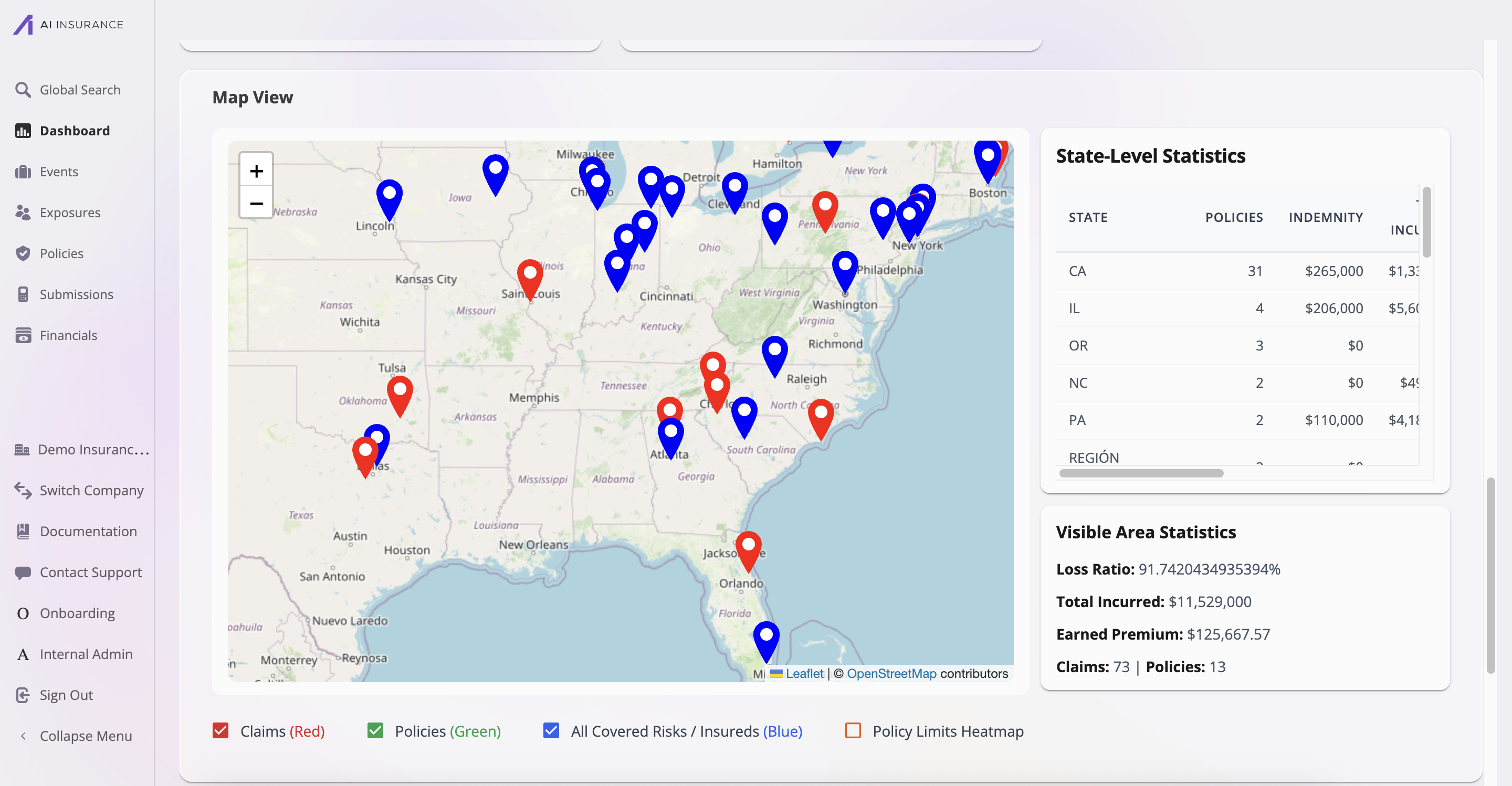
Map Display
The Interactive Map displays three types of entities using color-coded markers:- Claims (Red): Red pins mark the locations of all claims. Click on a claim marker to view details about that specific claim.
- Policies (Green): Green pins indicate policy locations. These show where your policies are geographically distributed.
- All Covered Risks / Insureds (Blue): Blue pins represent insured locations, showing where all covered risks and insured entities are located.
Map Features
- Zoom Controls: Use the zoom in (+) and zoom out (-) buttons to adjust the map view
- Map Legend: Toggle visibility of different entity types using the checkboxes in the map legend
- Interactive Markers: Click on any marker to view detailed information about that entity
- Geographic Coverage: The map displays data across all states and regions where your organization operates
Statistics Panels
The Interactive Map includes two statistics panels that provide additional context:-
State-Level Statistics: Shows a breakdown by state including:
- Number of policies per state
- Total indemnity amounts
- Additional financial metrics
-
Visible Area Statistics: Displays aggregated metrics for the currently visible map area:
- Loss Ratio percentage
- Total Incurred amounts
- Earned Premium
- Total number of Claims and Policies
- Entities without location data are automatically excluded from the map
- For policies without a policy address, the primary insured’s address is used as a fallback
- The API requires
company:readpermission to access map data